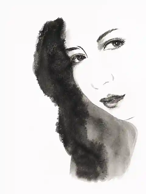
A painting built around presence
The first objective is not to reproduce every visible feature. It is to recognise what makes a person or figure feel present. In a portrait this may be the tilt of the head, a lowered eyelid, the tension of the mouth, the mass of the hair, the relation between neck and shoulder, or the direction of the gaze.
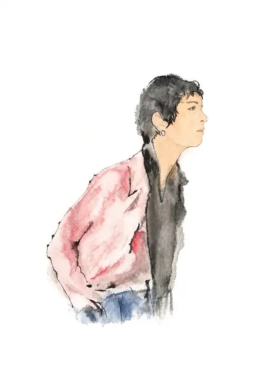
In a full figure it may be the way weight rests on one leg, a hand in a pocket, the fall of a jacket, the width of a trouser leg or the distance between two bodies. Resemblance is therefore approached as a matter of selection. A detailed image can remain impersonal; a few exact decisions can establish identity immediately.
Reduction as a working method
Every composition is subjected to progressive reduction. Background, repeated folds, secondary anatomy, continuous outlines and tonal variations are questioned before they are retained. The decisive question is not only what should be painted, but what can disappear without weakening the figure.
Reduction concentrates the image. Some elements dominate, some remain implied and others are entrusted entirely to the viewer. Apparent simplicity is therefore the result of many decisions rather than a shortcut in execution.
The paper is an active material
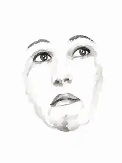
Untouched paper can become light on skin, a pale garment, the open side of a face, the space between two people or the point at which a body dissolves. It is not an empty background waiting to be filled.
At least one edge of a subject may remain open. A shoulder can stop before it is described, an arm can be interrupted and hair can lose density until it returns to the page. The eye completes what the hand has only initiated, making the viewer an active participant in the image.
One dominant mass
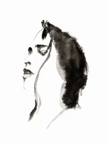
Many compositions are organised around a single large form: hair, a coat, a shadow, a torso, another figure or a concentrated area of colour. This mass establishes visual weight and prevents the smaller marks from becoming disconnected fragments.
One form may perform several tasks at once. A field of dark hair can describe the head, create facial shadow, establish direction and balance the untouched part of the sheet. This is one of the central forms of economy in the work: a single intervention carries multiple kinds of information.
A hierarchy of marks
Not every mark receives the same intensity. The composition is built through a clear order: one principal form, a small number of dark accents, a few transitional tones, light or incomplete lines and wide areas that remain unpainted.
The strongest accents are reserved for the elements that make the entire image legible: an eye, a mouth, a nostril, a jaw, a collar, a hand or the edge of an item of clothing. When every detail is equally emphatic, no detail has authority. The painting must state where the viewer should look.
The contour does not close the figure
A continuous outline tends to turn the body into a closed object. In this language, a contour can appear only where it is needed, be replaced by a tonal shift, emerge from the relation between pigment and paper, or disappear entirely along one side.
Preliminary lines may remain visible because they show how the figure was searched for and constructed. A slightly irregular line can carry more life than a perfectly uniform one. The aim is not to simulate vector precision but to preserve the physical character of the hand.
Selective precision
Water expands, pigment settles and edges change as they dry. These events are neither eliminated nor allowed to control the whole image. They are organised. One eye may be precise while a shoulder dissolves; the mouth may be one decisive stroke while the hair remains a broad, irregular field.
Technical control does not mean controlling every millimetre. It means knowing where precision is indispensable, where uncertainty adds expression, which edges must remain sharp and when the material should be permitted to act on its own.
Colour as emotional direction
Colour does not have to reproduce local reality. It can direct the gaze, establish a mood, identify a figure or hold the composition together. A single area of pink, blue, yellow or sepia may be more effective than colouring an entire garment uniformly.
Palettes remain deliberately limited so that colour does not compete with paper, ink and gesture. A typical image may require only black, one or two greys, a skin or sepia tone and one distinctive colour. If a colour does not change the reading of the work, it can be removed.
Choosing subjects
Technique alone does not create the language. The source image must already contain a readable gesture, silhouette or psychological tension. A technically perfect photograph may be less useful than a moment in which the subject is turning, waiting, listening, holding an object or moving out of the frame.
Transitional moments are particularly valuable because they resist the stiffness of a controlled pose. Clothing is treated as a second anatomy: a sleeve, jacket, hood, wide trouser or collar changes the silhouette, rhythm, weight and social presence of the figure. Subjects do not need to be idealised. Asymmetry, age, fatigue and unusual posture can carry more individuality than conventional perfection.
Recurring narrative territories
Presence
A figure appears through a few decisive marks and an open relationship with the page.
Solitude
Distance, waiting, reflection and the space around a person, without theatrical isolation.
Relationship
Two figures described through physical distance, body direction and the unpainted space between them.
Resistance
Bodies that retain dignity and presence under fatigue, vulnerability or pressure.
Loss
Absence suggested through dissolution, interruption and incomplete edges rather than literal explanation.
Intimacy
Hands, glances and small postures that communicate closeness without excessive description.
How a commission is made
- Intention. We define the function, audience, atmosphere, level of likeness, use of colour and relation between figure and space.
- Reference selection. We choose material that can sustain reduction: a clear silhouette, gesture, dominant mass and meaningful light.
- Structural study. We analyse the axes, proportions, focal points and distribution of white, middle tone and dark.
- Pencil drawing. The drawing establishes direction and essential anatomy without completing every form.
- First painted mass. A large intervention sets the weight, movement and visual gravity of the sheet.
- Structural accents. A limited number of darker marks make the image legible without closing it.
- Lost edges. Selected areas merge, fade or stop so that the paper remains active.
- Stopping point. The work ends when presence, hierarchy and emotional coherence are achieved.
- Faithful digitisation. The original is scanned or photographed and technically prepared while preserving paper, pigment and irregular edges.
Quality criteria
Legibility
The subject remains understandable at a distance and at reduced size.
Hierarchy
At least one area has enough authority to direct the viewer's attention.
Economy
Each mark has a function; repeated or merely decorative information is reduced.
Space
Untouched paper participates in the image instead of operating as passive background.
Material presence
Brush, pigment, water, drawing and paper remain perceptible in the delivered image.
Emotional coherence
Composition, density, colour and detail contribute to the same atmosphere.
Intentional incompleteness
Open areas feel designed rather than accidentally unfinished.
Originality
The solution belongs to the subject and brief rather than to a copied stylistic formula.
Applications
Personal portraiture
Individual, couple, family, commemorative, gift and pet portraits focused on character and emotional presence rather than mechanical photographic reproduction.
Editorial illustration
Images for culture, identity, health, work, relationships, memory and social themes that accompany a text without merely repeating it.
Covers
Artwork for books, albums, magazines, podcasts and independent publications, designed to coexist with typography and generous negative space.
Campaigns and key visuals
A hand-made visual centre for cultural, institutional, social, musical, fashion and brand communication.
Digital hero images
Compositions with enough open space to work alongside headlines, body copy and calls to action on websites and landing pages.
What distinguishes the result
The value of a manual illustration does not lie only in the fact that pigment was placed on paper. The subject is interpreted rather than filtered, the composition is designed individually, the omissions are specific and the gesture cannot be replicated perfectly.
The delivered image retains real variations in surface, pressure, transparency and edge. It is not a stylistic treatment automatically applied to a photograph. It is a new image constructed through visual, material and narrative decisions.
What we do not pursue
The studio is not oriented toward complete photorealism, mechanical photographic reproduction, digitally perfect surfaces, uniformly filled pages, decorative detail without purpose, industrial uniformity or exact imitation of another artist's style.
This is not a rejection of precision. It is a more selective form of precision: each retained element must help support the whole image.
A language developed through series
A recognisable language is not produced by repeating one successful formula. It develops by applying stable principles to different subjects. Series allow the studio to compare how much a face can be reduced, when colour is necessary, which edges can disappear and when a visual solution has become repetitive.
Consistency comes from format, material, palette, theme and a shared level of reduction. Originality comes from allowing each subject to demand a different arrangement of those elements.
Studio discipline
The apparent spontaneity of the final image is supported by a structured practice: daily observation, reference classification, monochrome studies, mass tests, edge analysis, limited-palette work, production in series, archiving, dating and critical selection.
The objective is not to discover one fixed solution and repeat it. It is to build a system stable enough to be recognisable and open enough to respond to different people, publications and commercial contexts.
18
Ten operating principles
Observe before describing
Identify the gesture, relationship or form that carries the subject's identity before deciding how much to draw.
Reduce before adding
Remove information that does not contribute to presence, structure or emotional direction.
Build one dominant mass
Give the composition a centre of gravity through hair, clothing, shadow or a concentrated field of colour.
Create a hierarchy of marks
Reserve the strongest accents for the few elements that make the whole image legible.
Let the paper breathe
Treat untouched paper as light, distance, anatomy and an active part of the composition.
Keep contours open
Alternate definition, interruption and dissolution instead of enclosing every form with a uniform outline.
Accept controlled imperfection
Preserve irregularities that reveal pressure, water, pigment and the physical movement of the hand.
Use colour with responsibility
Every colour must direct attention, establish mood or identify the subject. Decorative colour can be removed.
Stop when presence is achieved
Completion is reached when the image is stable and alive, not when every visible detail has been described.
Develop through series
A visual language becomes reliable through continuity, comparison, selection and repeated work on different subjects.